Namma Dosa
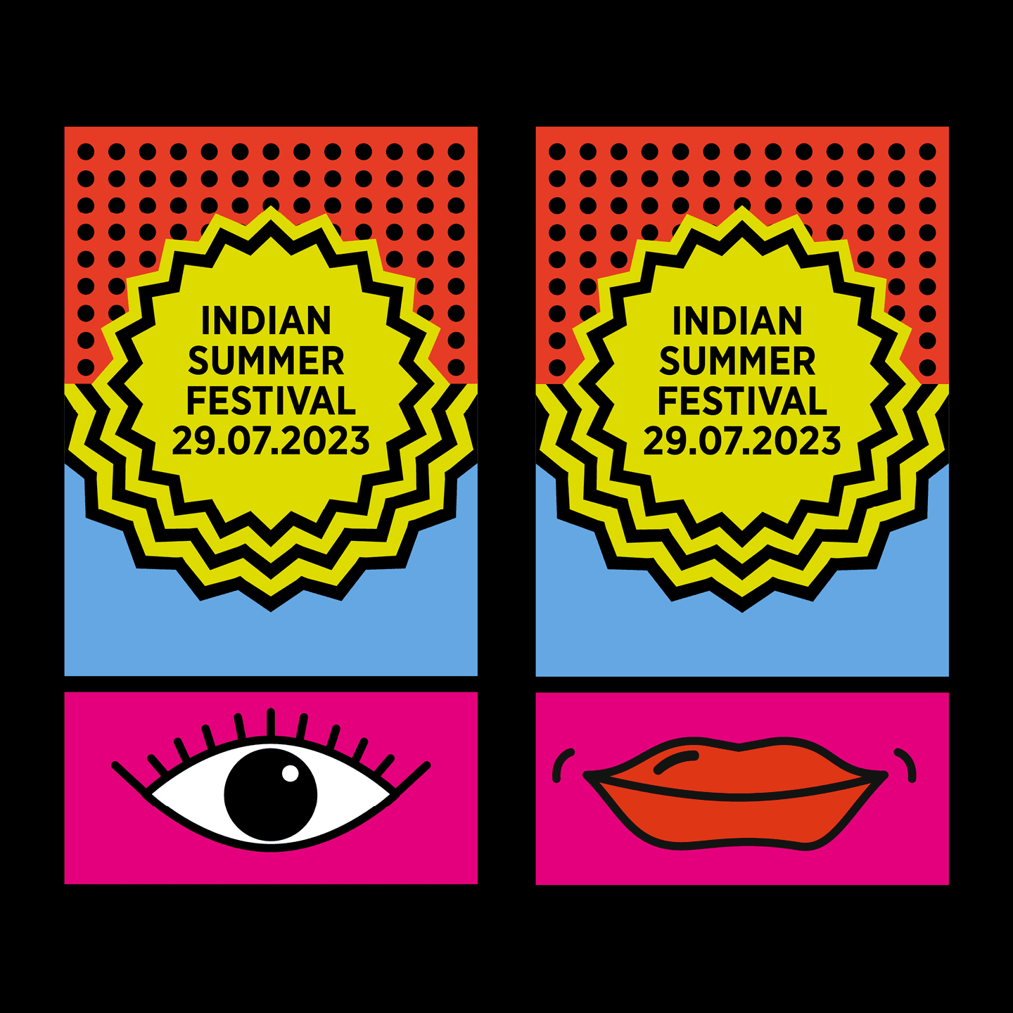
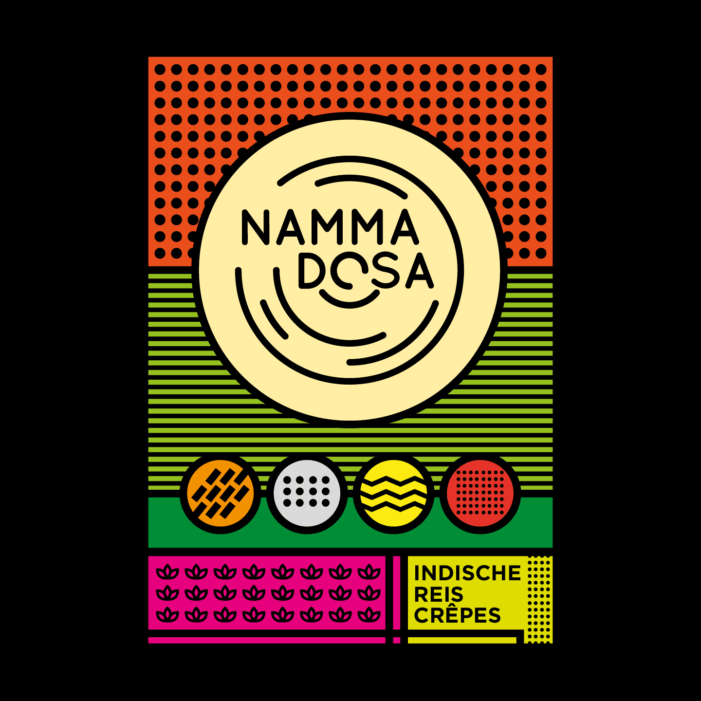
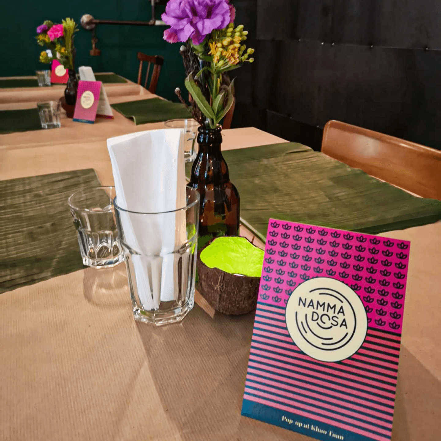
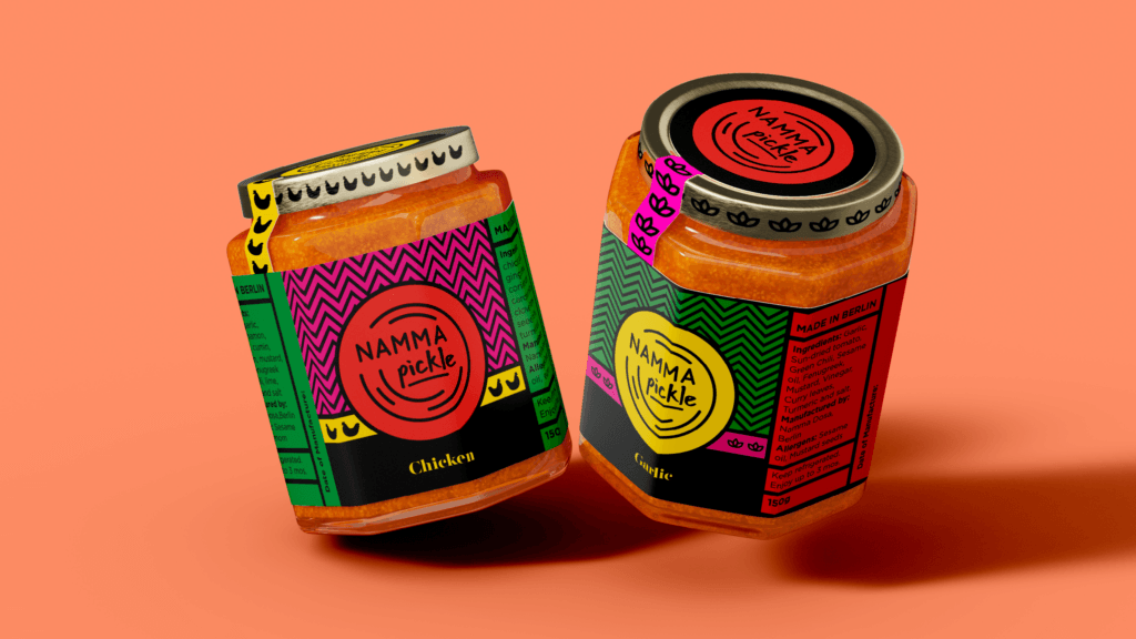
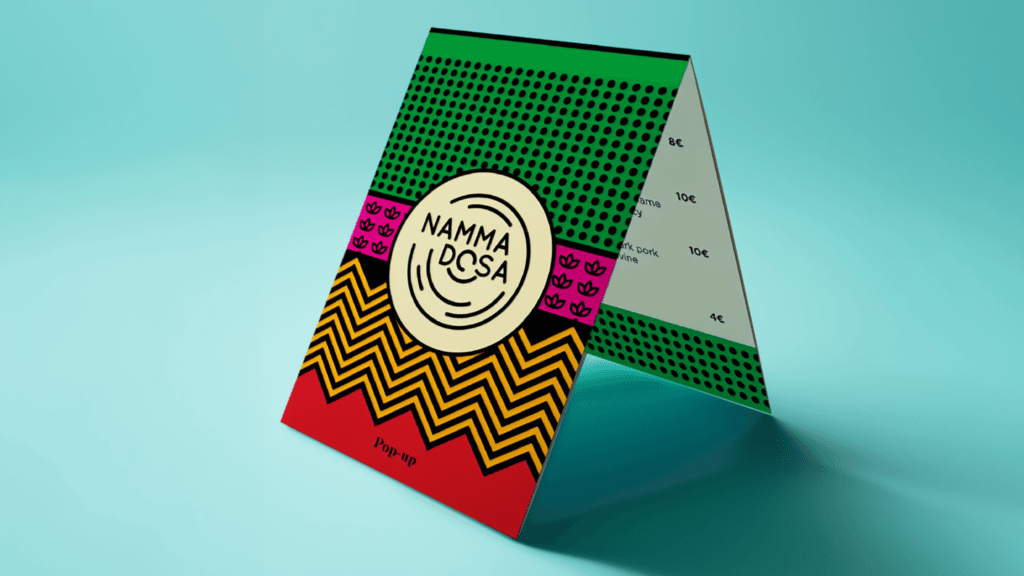
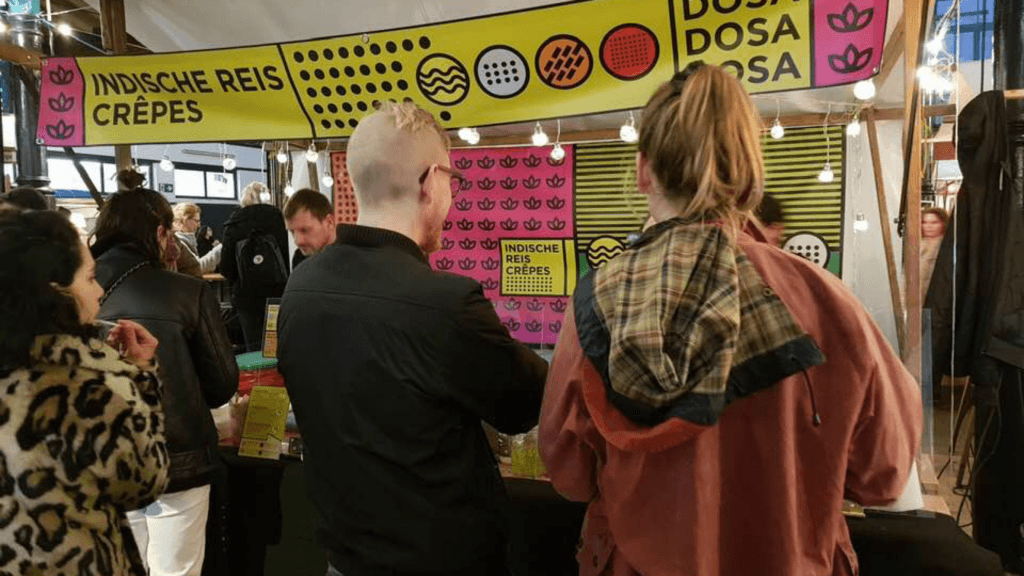
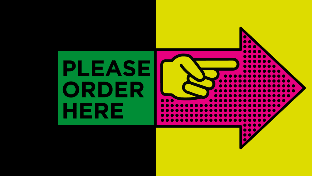
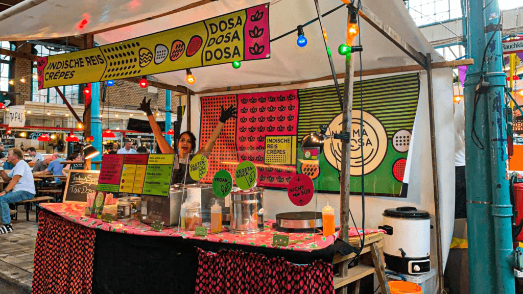
How do you brand a genre of food loved by an entire subcontinent and make it feel both joyful and versatile? As designer and client, this was no easy feat. I built the identity from the ground up: logo, colour system, typography and a visual language that travels easily from Instagram to event stands to print. Colourful, unapologetically South Indian, and designed to tell a story without a single word.
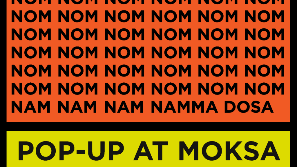
Namma Dosa began as a simple idea, just a few dots and colours but gradually evolved into a distinctive brand language that resonates with a wide audience. One of the most rewarding parts of the journey has been receiving real-time feedback and seeing how genuinely people connect with both the brand and, of course, the food itself.
Six years on, I still haven’t grown tired of the design, which is rare. Its versatility continues to stand out, managing to stay playful while consistently communicating the right message.